
This week class was all about layer styles and typography! Who knew so much goes into picking out the right type of font? Layer styles are also a fun way to add character to your typography with options such as drop shadow, inner glow, or bevel and emboss, you’re sure to find a style that will make your typography stand out.
With this in mind, week 4’s showcase assignment was received with excitement, as we were asked to design a chalkboard-style graphic that would promote a local coffee house. I decided to design for a fictitious coffee house, mostly because I don’t know of any local coffee houses around where I live. How is that possible you ask? Well, that’s because… I don’t like coffee! There I said it! Now that that’s off my chest onto the assignment!
TO THE DRAWING BOARD!
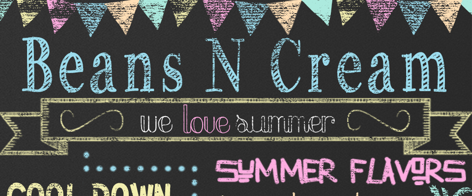
Before I could even pick which provided chalkboard background I wanted to use I needed to figure out what type of fictitious coffee house I was designing for, and how they would want to be marketed. Because this assignment seemed like one that I could get really creative with I decided to go for a fun, colorful approach, and with that I chose the coffee house name “Beans N Cream”. Since it’s almost summer (at least I think it is, New Jersey doesn’t quite think so temperature wise) I decided to market this design towards summer specials and treats to get customers to come in, cool off, and relax at their coffee house (ironically enough).
The following are the requirements that our design had to contain:
- One of the provided chalkboard backgrounds
- At least 4 different fonts, one of which is a dingbat
- At least 3 different chalk styles that were provided
- At least 3 ornaments that were provided
- We also had to design a text oriented logo, as well as the entire design had to look like it was designed with chalk.
Because this design has a lot of components, I decided to start off by announcing which fonts/dingbats I used, rather than identify each and every text line with its corresponding font (all font choices were downloaded through dafont.com or fontspace.com):

MY DESIGN THOUGHT PROCESS:
After the chalkboard background was selected (a “new” blackboard background was used in order to make the colors of the chalk styles pop) I decided to place the coffee house name, Beans N Cream at the top, but I knew I wanted something to go above it. In researching chalkboard Photoshop images, I came across a design for a baby’s first birthday that had a flag banner at the top. I really liked this concept and found a similar dingbat on dafont.com. This ended up being more time consuming then I thought as each flag needed to be on its own layer in order to have a different style layer utilized. I decided to use five main color chalk styles for the banner that are also used throughout the design. For this assignment I used a lot of color styles, mostly because I remember when I was a kid I never just drew with two or three pieces of chalk, I was the kid with the colorful driveway since I used them all, and since this coffee house has a fun outlook I thought they would too!
From the top I jumped right to the middle and decided to add a summer special in a big way. I previously came across another chalkboard design where a large word was slanted across, and I knew I wanted to incorporate this in my design. Because of this, I had unintentionally created all this space at the bottom of the board. I decided to create a social media marketing spot on the chalkboard asking customers to share, post, or tweet their favorite summer treat from the coffee house, referencing Beans N Cream’s social media tags. I thought another great technique would be to highlight that the coffee house offers free wifi, which might persuade customers stay and relax which could mean they end up ordering more than one menu item (the wifi icon was crated using the brush tool).
Now that the bottom and top portion were completed I needed to fill in the center. I decided to highlight some summer coffee flavors as well as a new menu addition, fruit creamers. Because of the slanted space I designed the “Summer Flavors” section first and used sun dingbats as bullet points. Since I had space to the right and didn’t want to squeeze in another flavor below black cherry crisp, I decided to create a beach scene with a palm tree and ocean water to give off the summer vibe. Also going into this assignment I wanted to try putting together a text copy with multiple words having different typography, and with that the fruit creamer copy was born! The word creamer actually gave me some trouble at first because I could not figure out how to get the letters from big to small, until I stumbled upon the warped text option. The pen tool was used to separate the copy sections with dotted lines, and a pineapple, and drink dingbat was added for some summer flare.
I was getting really excited looking at my design and checking off my assignment requirements until I remembered that we needed to incorporate 3 ornaments. This was the part of my assignment where I came to a standstill. It look a bit of moving around, but since a lot of my other text copy were tight together, I decided to add the slogan “we love summer” in one of the banner ornaments that were provided. Two swirls or swooshes (ornaments also provided) were added on either side to highlight the text.

I had so much fun creating and designing this assignment while utilizing the topics we discussed this week and hope you look forward to next weeks design as much as I do!