CLIENT OVERVIEW:
University of Florida landed Tower Hill Insurance Group, or THIG, as the client for our Capstone Class final project. Students were broken up into teams based on how we identified our individual skillset. this ensured each group was well rounded in the following areas, branding, coding, design, research, and writing. I was partnered with three other students and our team name was White Owl Designs.
THIG is the largest writer of homeowner policies in Florida, with over 400 employees and soon expanding to four additional states. During the client presentation we learned about their company strengths, weaknesses, opportunities, threats, and marketing strategy. A redesigned thig.com will check off the following objectives:
- establish and build the brand
- lead generations
- consumer education and loss provention
Three words the client used to describe the new site would be : impactful, helpful, clean & responsive.
THIG identified pros and cons about the current site as:
Pros
- WordPress custom theme
- Consistent and on brand with a hint of personality
- good cross browser compatibility
Cons
- Not mobile friendly
- cluttered for SEO strategy
- Agent Search offers poor UX
Our work with THIG was broken down between multiple projects leading up to a full redesign custom WordPress launch.
SITUATION ANALYSIS
In order to understand our client’s current situation beyond their initial presentation we were tasked with conducting a thorough situation analysis using cited secondary information. The contents of the analysis include: organization overview, target audience, industry analysis, competition, general communication strategy, and SWOT analysis. You can view my teams situation analysis here.
LOGO REDESIGN PROPOSAL
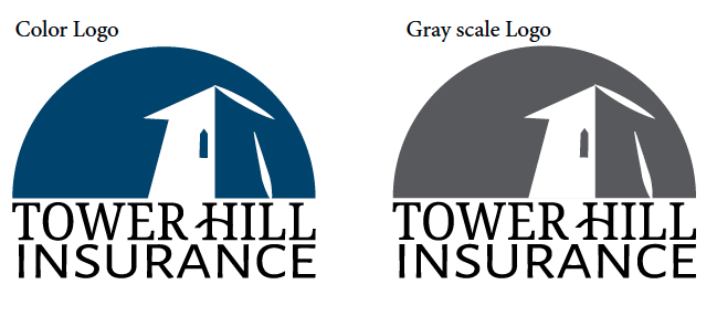
Teams were tasked with creating a new logo for THIG based on our situation analysis. THIG’s current logo:
Tower Hill Insurance Group Logo; source: thig.com
White Owl’s redesign proposed logo is below:
Redesigned logo by White Owl DesignsLogo Design Process: We first began by analyzing the original logo, reading through the situation analysis, and thinking about Tower Hill’s audience. Other areas we kept in the back of our head were ways the logo would be produced and scaled, and what their competitors’ logos are. We noticed that most competitor logos are text based with some sort of image element, whether that be an actual image design, or a letter graphic design.
Overall as a team, we cohesively kept the tower visual image as part of our sketches and we agreed that it was a vital part to Tower Hill’s mission and presence to their audience, especially since their slogan is “look to the tower”. After meeting and discussing all of the sketch choices we decided that Alice’s first logo choice was the strongest. You can read more about our decisions in our logo redesign rationale statement. THIG decided to keep their current logo after hearing our redesign presentations, because of this moving forward we used their current logo in our branding materials.
WIREFRAMES AND MOCKUPS
Teams were asked to design wireframes and mockups of the new website. Each team member was responsible to sketch a wireframe of the homepage, then as a group we decided on a final design. Our team was on the same page for this project, based on the wireframes that we presented to each other we took bits and pieces that blended into our final wire-frames and mockups. From the team meeting I took our group notes and decisions and designed the wireframe, once finished I sent it for approval to the team and from there another team member worked on the mockup. Both wireframes and mockups were created using Photoshop.
Below are links to view both the desktop and mobile versions of the homepage wireframes and mockups:
DESKTOP HOMEPAGE – WIREFRAME | MOCKUP
MOBILE HOMEPAGE – WIREFRAME | MOCKUP
CAMPAIGN STRATEGY AND DESIGN PIECES
Our team split up the tasks of the campaign strategy, my focus was on a brochure or informational flyer. I designed multiple colored options for the informative flyer that showcases important information about what THIG’s clients can do to prepare before a hurricane strikes. Below was the team chosen design, as the red alerts the flyer of the importance/severity of content situation.
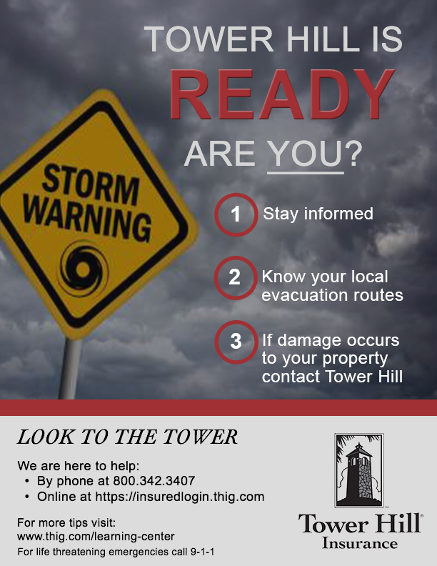
THIG information flyer design
USABILITY AND USER EXPERIENCE TESTING
Our next deliverable was as a team to create a rough draft of the website. We split up the page coding, and I took on the post and section pages of the custom WordPress site. After submitting our rough draft our the competing teams evaluated our site for content and usability. Each member of the other teams tested our website as if they were a first time user, and in return answered teacher distributed usability testing questions.
Below are the conclusions from the usability testing of our peers :
Positive user feedback:
- Find an agent icon was eye catching in the top right corner
- no broken links
- load time good
- positive mobile experience overall
- cross browser compatibility
Constructive user feedback:
- search bar was too large
- drop down navigation hard to read
- responsive sizing of certain sections
- let the user provide additional information in the contact form
- confusion on which page they were one, suggested breadcrumbs and page headers
- not completely responsive
We also received the following client feedback on our rough draft site:
- on brand good use of space
- nice integration of the learning center articles at breakpoints
- search box is overwhelming
- drop down navigation color makes it hard to read
- wants to see a quick quote section displayed closer to the top
- quick quote product drop down needs a drop down indicator
- sidebar is too generic looking
Our team met to read thoroughly through the client and user feedback. We made several of the changes that were suggested to help with content readability and usability of the site. Below are the changes we decided to make as a team:
- search bar was too large – minimized the size of the desktop search bar, for mobile and tablet view a search bar icon was created.
- drop down navigation hard to read – a dark blue background with white font was used to increase the distinction between the background and text.
- confusion on which page they were one, suggested breadcrumbs and page headers – breadcrumbs were added to the top of the page content.
- not completely responsive – additional changes were made to complete responsiveness of the site.
- wants to see a quick quote section displayed closer to the top – For the desktop we moved the quick quote section within header image/video of the homepage. This allows the user to view above the page break. Quick quote was moved to the second section on the mobile version.
- quick quote product drop down needs a drop down indicator – an arrow indicator was added to let the user know that there are more options in the form of a drop down.
- sidebar is too generic looking – the sidebar was redesigned, a slight shadow effect was added to the boxes backgrounds and the grey and dark blue from the color scheme to make the call to actions pop.
You can view our final Tower Hill Insurance redesign website here!
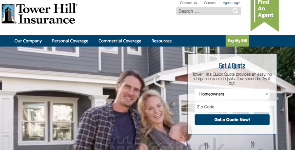
White Owl Designs redesign homepage for THIG