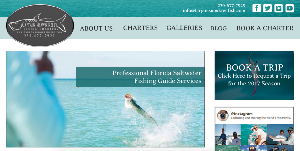
This is an exciting post for me, because it is about my first freelance project post graduation. I was contacted by a family member on behalf of a friend Captain Shawn Kelly, a saltwater fishing guide in Southwest Florida, who needed a website redesign. His current site, Tarpon Snook Redfish was outdated and he didn’t have access to update any of the content. After our initial phone consultation his site goals were clear: to rank high in SEO, be responsive, increase reviews, book more fishing trips, and showcase his boats and photos/videos.
WIREFRAMES
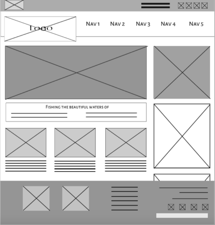
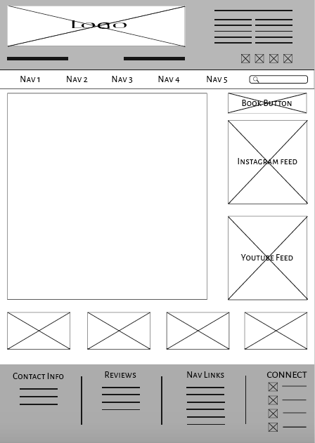
After our discussion I started by researching competitor sites and then began working on the index page wireframes. I emailed the client 2 wireframe versions to look over and scheduled another phone consultation to discuss.
Version 1
Version 2
MOCKUPS
The client liked version 1 the best top header, large photo, and footer content. He was excited to see the mockups, which was my next step and one I was really looking forward to as their my favorite part of the design process. When it came to a color scheme I had creative/color freedom as I was only given a with black and white/grey logo to work with. For the color scheme I decided to look for inspiration in previous trip photos that he took. He had a set of photo that were so vibrant and fresh with color, mostly blues and greens, colors that you would associate with fishing and Florida. In the end I decided with greens for the menu bars and to add texture I found a royalty free fishing photo and used a portion of the water as the top header and footer background. The right side of the homepage would house a sidebar that would plug the media content of photos and videos that the client wanted to display. Buttons will also be created to direct users to a contact form page and a way to review the client’s services.
Below is a screenshot of the mockup homepage I designed using Photoshop:
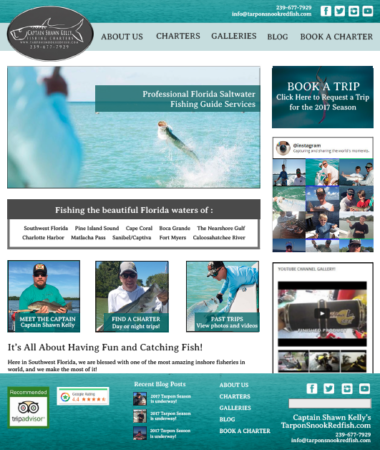
The client praised the color scheme and overall feel of the site and was excited to see the rest of the mockup pages. Below are the links to the mockups for the rest of the site.
MOBILE | ABOUT US | CHARTERS | GALLERIES | BLOG | CONTACT US
FEEDBACK & CHANGES
After viewing the mockups the client signed off and I began coding the site. Once the initial round was completed I asked the client to take a look around and give feedback. Although on the mockups the homepage looked ideal the client noticed that once the user enters the site there is ALOT to look at and it can be overwhelming, they suggested instead for a large photo slider. This was a great suggestion and the change was made right away!
The other major change was in regards to the sidebar. The client liked the social media content on the side but after running speed tests, the YouTube section was slowing down the load time of the homepage; this was changed to a YouTube link instead. In thinking back to Capt. Kelly’s primary goals, I wanted the to have an easy way to access the links to review his services and request a trip. I decided to create custom call to action buttons that would stand out to the user. Capt. Kelly was thrilled that these were added (plus that his photos were used as the backgrounds) and he asked for them to be displayed at the top of the sidebar.
SEE CAPTAIN SHAWN KELLY’S NEW SITE HERE!