This is my second project, that I created for myself, for my internship with GoodLife 45. My first, was the calendar page usability redesign.
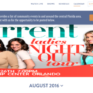
This project has the same concept, except I am focusing on their blog page. Below is a screenshot of their current blog site (minimized slightly to show most aspects).
The page starts out strong with the large blog header post image, but then the user gets lost coming across links without a title and someone without prior blog interaction, in my opinion, would have no idea that they are categories as traditionally that is located on a right sidebar. This also made me wonder if you don’t look at the URL would the user know they are on a blog page? My supervisor agreed this is a page that took a hard cut when it came to the website redesign and didn’t receive the same care and attention as the other pages because the web design lead on this project didn’t think that a blog was as important.
Below are screenshots of the mockups I created in Photoshop, the first allows their current layout minor updates to improve the flow of the page. The second adds the traditional sidebar layout with a category/topics sidebar and adding in the popular tags sidebar. Since I would plan on this remaining static, I relocated the search bar to the top of the sidebar to be accessible at all times to the user.
Version 1: (This version adds a border background to the categories and a title to describe what the links are)
Version 2: (Utilizes the customary sidebar to house the category links and added in tags. The search bar is also relocated to above the side bars. The goal is that the sidebars would stay static).
I presented the above screenshots to my classmates for feedback. My design process was welcomed and the second version was most accepted amongst my classmates. It was suggested to integrate a social media section which was a great idea. I redesigned version 2 to include the social media section:
Version 2.2
I presented the 2 versions of the blog mockups to my supervisor who agreed with the comments that the sidebar widget is the most appropriate and engaging. She asked me to update the mockup so that the whole sidebar is that purple-ish color (as well as a font update). I resubmitted her design request and the CEO also signed off on the page updates. I then worked with their web developer to implement the changes.
You can view the redesigned blog page here!