** Pizza Planet Style Tile was created as a project in Advanced Web 2 during my studies towards my masters in Web Design and Online Communication through the University of Florida. Many of the aspects in this site were required per project requirements and was created for education purposes. I am in no way affiliated with Pixar or Disney.**
This is the second phase of my Advanced Web 2 final. The first deliverable was designing a Style Tile and Prototype, you can read about my creative design process here.
DESIGN PROCESS
Since we have a style tile and a responsive prototype we don’t have to start with an empty slate, we have a direction from the beginning. This then allows me to focus my efforts on the more important question: what would the users be looking for? Some of these answers were requirements for the project
- Contact information
- Location
- Hours
- Restaurant Menu
PAGE DESIGN DECISIONS
HOMEPAGE
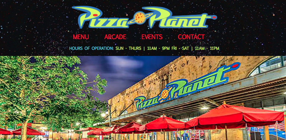
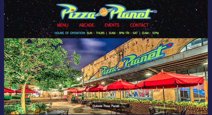
Because those are the top motives a user will visit the site I designed the header so that the above information is available within one click of entering any page. The font colors of these items are neon and on a dark background attract the users eye. A large header photo anchors the homepage inviting the user to envision themselves at Pizza Planet. Hover over the welcome to pizza planet header to display a fun surprise (this is a custom jQuery code that adds interactivity).
MENU
The menu page was designed to project requirements, names, photos, and pricing of the menu categories are displayed. When the user hovers over a menu image a neon highlight lights the image and when the user clicks on the image a description of the item is displayed (this action was a javascript requirement).
Two separate JavaScript event listeners were written for this site to add content, and both can be found on the menu page. This first is an event listener that listens for a click on the header “Pizza Planet Menu”, and once clicked by the user displays the special dish of the day that can be ordered. This is typically a special rendition of a dish found on the menu. The second add event listener was used on the menu images. When the user clicks on an image the description of that food item is displayed. (These were created using class notes)
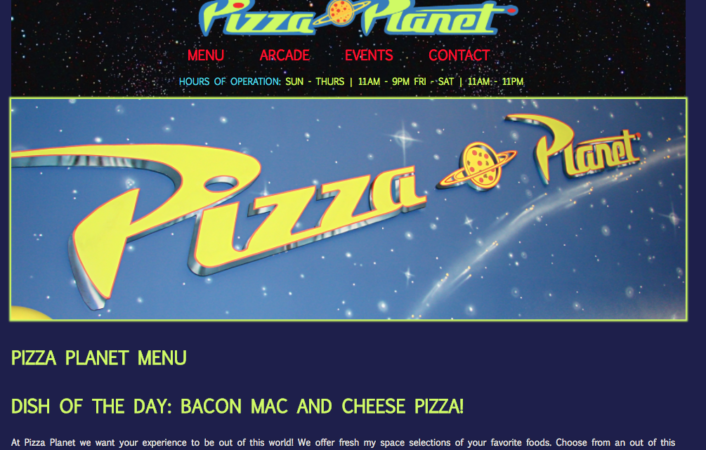
Pizza Planet Fictional Menu Page, image shows the dish of the day displayed a hidden easter egg when the user clicks on the pizza planet header text.
ARCADE | EVENTS | CONTACT
The content on the arcade page is within theme, displays information about the games, and includes a photo to attract the user. In addition, an eye catching promotion is displayed letting the user know about token discounts on a particular day of the week.
The events page houses a fun compilation broken up between 3 different categories: current promotions, upcoming events, and info about how to host a birthday party. The layout breaks up each event into outlines sections allowing the user to easily distinguish header, content, and photo for each.
There are various contact methods on the contact page, which allows the user the ability to choose which one they want to use. A phone number, address, social media links, and a contact form is displayed for ease of use.
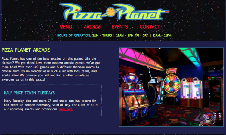
Pizza Planet Fictional Arcade page
MOBILE FIRST
The key requirement of this project was to create the site mobile first allowing the user to view the site easily on any device. A red mobile nav appears in the top right corner when viewed on a smaller device screen. The color helps to attract the users eye for they can easily find the navigation links. Although responsive development requires thoughtful planning, making the transition between smaller screens to large is not as difficult as the reverse, and honestly for this site I prefer the mobile layout design over the “desktop”.
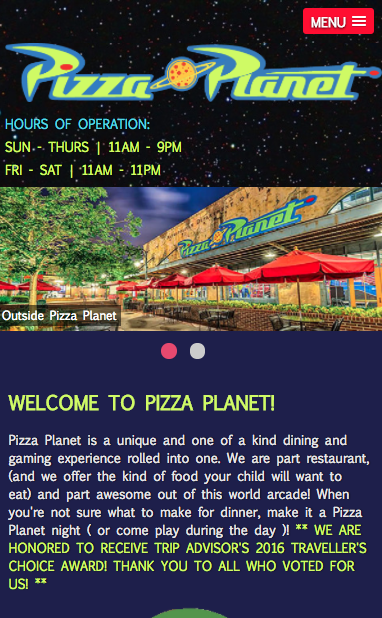
Pizza Planet Fictional Homepage mobile layout
To view the full website click here & feel free to change the size of the screen to see the responsive design.
