I virtually interned during my last semester (Fall 2016) with Good Life 45 a Christian TV broadcasting station located in Lake Mary, FL. Recently before my internship began they went under a website redesign, and the outcome was very impressive. However, there are still certain areas of the site within certain pages that can be improved upon even more. The first week of my internship my supervisor had me search through the site and make a list of aspects of the site that I would change if I was in charge. Although many of my suggestions were minor, two pages I offered more suggestions on were their calendar page and blog page. After verbally talking over my suggestions with my supervisor I was under the impression that what I was saying wasn’t translating well. I took it upon myself to create two projects where I designed mockups for the calendar and blog page in which I can show different ways that they can enhance user interaction with the site.
Calendar Page Mockup
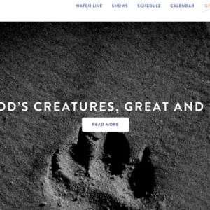
Here is a screenshot of their current page
The page itself has a lot of great aspects but the part that confused me from the beginning was the banner/hero image since it is the first item that you see. On top of the image is white wording and a button. When I first visited this page I could not understand what the date was in reference to as it wasn’t the date that I visited the site. I soon came to realize is was showing the date of that image event. My first reaction was “that is most likely already in the image why is it blocking the image?” I knew that was one item I wanted to remove. My second thought was “what does that button on the image do?” Originally I thought that it was a way to save that event for me to remember because of the placement, but the button title says “create event” which is confusing. Clicking on the button allows an outside partner to submit an event to be featured on their calendar page. I thought the whole placement was super confusing so that is what I focused on.
I submitted 4 mockup designs, all created in Photoshop, to my supervisor in an email which showcases how to better improve the flow of the site:
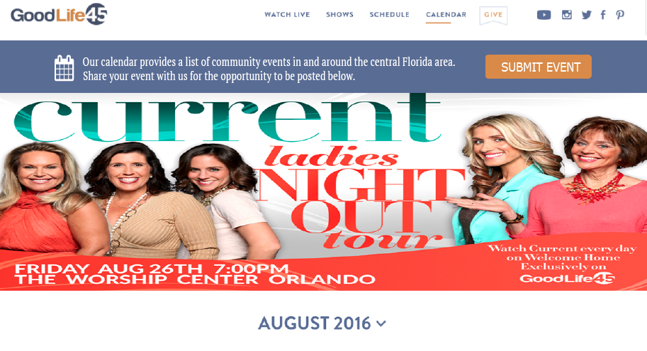
Version 1 (Approved version): Version 1 removed the wording over the image and implements a simple top bar describing what the page showcases as well as how to submit an event to be features on the page.
Version 2: (Similar to version 1 except the bar is moved under the feature image):
Version 3: This showcased a slider image with multiple events instead of just one.
Version 4: (This version removes a feature image entirely)
My supervisor and I had a followup phone call in regards to the mockups, she presented them to the CEO of the company and version 1 was approved to implement. GoodLife45 is contracted with an outside web development company, because of this I worked with my contact at the company and provided him with the approved screenshots and approval notice from my supervisor. To help me gain further experience I also provided him with the code to add to the site to implement the change. He was very receptive of the change and agreed it would enhance the page.
You can view the changes on their calendar page here!