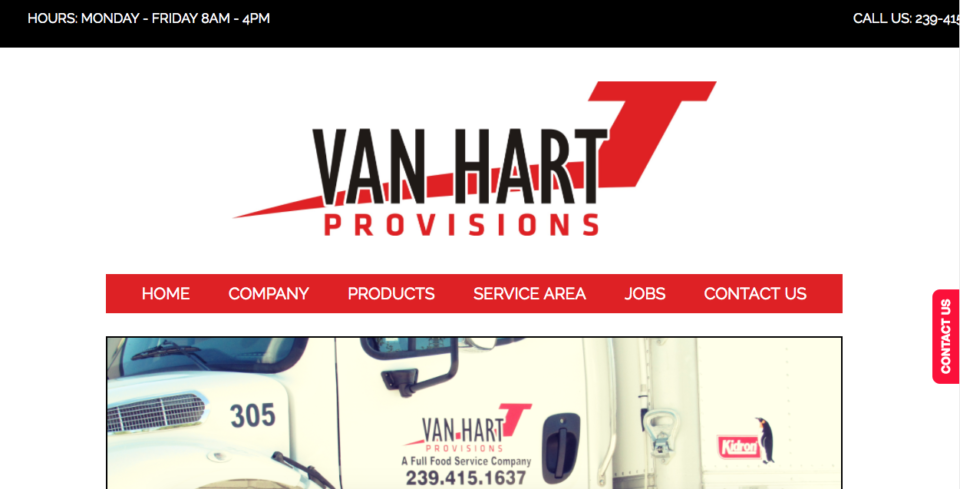
During my Web Interactivity course, one of our projects was to create a custom theme WordPress site for a client, with our role being the freelancer. The end goal being that the site should be completely stable and able to be handed off to the content manager. I decided to use this opportunity to create a site for my uncle’s business, J Van Hart Provisions is a full food service company located in Fort Myers, Florida, since he does not currently have a presence online.
I began my freelance role by setting up a meeting with the operations manger where we could discuss our expectations for the site and go over preliminary client questions. During our discussions it was communicated that a classic site design (nothing fancy) sticking to the company’s color scheme was expected displaying the following pages: about us, pricing & products, contact, and a blog page (a blog was required for the project). It was also discussed that certain aspects had to be created for my assignment but that changes could be made after to reflect different pages as need, and more importantly that because they are using WordPress they can make those changes themselves.
WIREFRAMES & MOCKUPS:
Per project requirements two wireframes were designed for the homepage of the site. Although both versions are similar, they pose one large difference (menu placement) and smaller subtle differences (hours placement, footer ect.).
When the user first enters the site I wanted a large image of the company to welcome them. Thinking back my discussion with the client about a simple site I decided on a large logo and the hours of operation at the top with the phone number, since prior to this site that was the only way to reach the company. Underneath the header image I designed a card content layout with brief text about the main pages and links to access them. In the footer I displayed the company’s preferred partners (or their clients) along with business information.
The color scheme was used based on the original logo and colors selected by the client. All imagery was used for education purposes for the assignment.
Version 1 – Classic | Wireframe – Mockup
Version 2 – Simple | Wireframe – Mockup
The wireframes and mockups were presented to my classmates for feedback. It was suggested that the classic menu bar was a better option for the company. Based on the feedback different elements were selected from each mockup to create the final version.
With a final version of the index page selected we were tasked with creating mockups for each secondary page. Click the below pages to view their mockups I designed in Photoshop:
Index | About | Products | Service Area | News | Single Page | Contact
The Mockups were then used to create the final assignment product. After the class was finished the project site was presented to the client who was excited about the final project. Communication was made that not all of the aspects of the project fit their needs so adjustments were made.
After graduation, I helped the client acquire their domain and hosting to get the website set up. WordPress was installed and their custom theme was activated. You will notice slight modifications from the class project to the launched site based on their needs. The site has been handed off to a member of the clients staff who maintains the content of the site and is imagery.


