 Imagery planning was this week’s focus in Digital Imagery, specifically with focus on mood boards! You’ve probably seen at least one mood board before, especially if you are a frequent pinner of the Pinterest world. Mood boards are a collection of arranged images or text that help to communicate the particular feeling or style you are looking to achieve. This is particularly useful as part of the planning process when designing a website or web imagery.
Personally, this assignment couldn’t have come at a better time as I am taking another class this semester, Web Design Principles, in which we are working on coding a website of our choosing. I have chosen to work on a website that will display myself as a designer to the web community through my own portfolio website. With our wireframes already designed we are currently working on creating a visual mockup of the site, which is why this week’s showcase assignment was so useful, as I decided to design my mood board for my own brand to help with inspiration for the overall feel and theme for my portfolio site.
LET’S GET PLANNING!
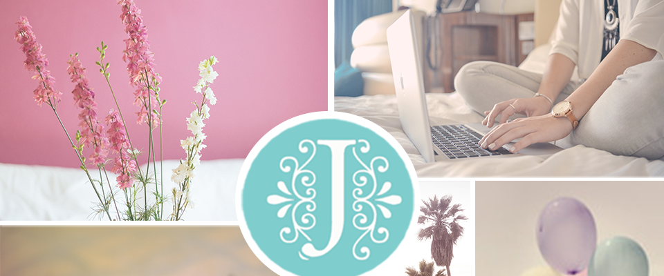
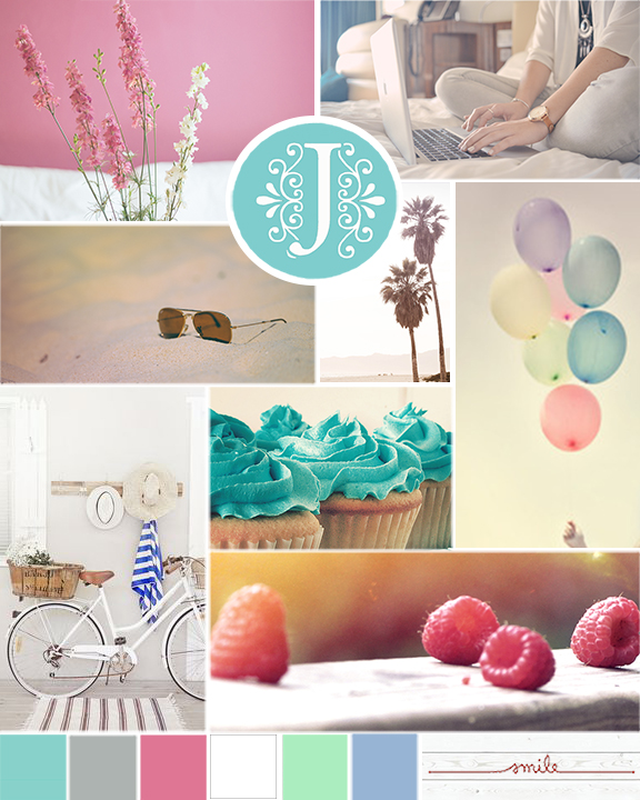
For this assignment we were asked to create an 8 x 10 high-resolution mood board. In one of the readings this week there was a short tutorial on how to create a mood board layout. I had chosen the video’s mood board layout for inspiration however the layout I created myself as we were not allowed to use a template. First I began adding colored rectangles to not only help block out where the images would go but this was also needed in order to create the clipping masks for your images. As I created the rectangles I created guidelines for the layout as learned in the tutorial (all image blocks were spaced out by .1 inches to help create white space between them). I knew I wanted smaller blocks to showcase my color choices and decided to place three blocks toward the bottom so that your eyes would start with the images and then end with the colors. I decided to add a circle block towards the top/middle which I wanted to showcase an image that would help spark inspiration for my brand’s logo. Also, I decided to keep the color white as the background separation lines to complement the simple clean concept.
After a lot of maneuvering and resizing the layout was in place and it was now time to decide how exactly I wanted my brand to be portrayed, which would help in selecting the right photos and text images. Overall I wanted my mood board to reflect my personality which should come across through my website. I thought about how I would describe myself: I’m fun, yet grounded; determined, yet open-minded; colorful, yet simplistic, and well, extremely detailed and organized. With these descriptions I began writing down key words that would populate images that would best describe me, those words were:
- Simple
- calm
- smile
- organized décor
- cupcakes
- balloons
- aviator sunglasses
IMAGES GALORE!
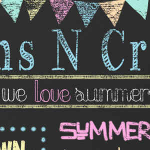
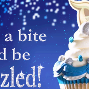
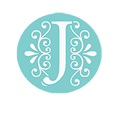
One requirement was that our mood board needed to contain at least three photographic stock images. For this, I went to Pexels.com and began browsing and searching the key words above. What I really like about this site is that it is simple and user friendly, and they have really great (royalty-free) high-resolution photos, which means you can copy or even modify the photos, which are free for personal and commercial use. In browsing the site I actually came across five high-resolution photos that I used in my mood board: sunglasses on the beach, palm trees, flowers against a pink wall, raspberries, and a woman typing on computer. The cupcake, bike, balloons, monogram J, text image smile, as well as the white wood background are all Google images found when searching those key words I mentioned before.
With my images picked out it was time to add them to the layout using a clipping mask. I placed the images, one at a time, over the square in which I wanted it to be positioned. Then in my layers panel I just right clicked on the image and clicked create clipping mask, and voilà it was that simple! As my images were coming together I than had left myself three-square smaller blocks in which my color palette would be displayed. I had chosen my three favorite colors: green, gray, and white, but once I zoomed out and looked at the whole picture I realized my mood board would not have been accurately represented in only three colors, plus one of the words I used to describe myself was colorful! With an almost finished mood board, I decided to break up the three color squares into six, and applied an Action (also required for the assignment) to help make it easier to size the blocks since they were all the same. I recorded resizing one of the blocks and the rotation and then replayed it in order to resize each one without having to manually re-create.
GOT TO ADD COLOR!
With my six smaller new squares in place it was time to focus once again on the color pallet. In our instructions we were also asked to incorporate this year’s Pantone color of the year as well as two other colors from previous years. This year’s Pantone color of the year is Marsala, although a beautiful color, it was hard to for me to figure out how on earth I was going to make this color fit into my mood board design. Ultimately I decided on using Marsala as the color for the word “Smile”, as it was a small enough touch that it blended in nicely with the other colors. Below is a list of the Pantone Colors of the year used in my mood board along with their RGB/CMYK values:
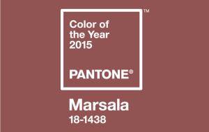
- Pantone’s 2015 color of the year Marsala: (RGB 150,79,76 CMYK 25,77,64,11)
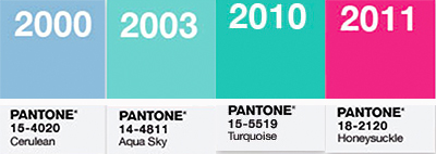
- Pantone’s 2000 color of the year Cerulean Blue: (RGB 152,180,212 CMYK 40,21,5,0)
- Pantone’s 2011 color of the year Honeysuckle (RGB 214,80,118 CMYK: 13,83,34,0)
- Pantone’s 2003 color of the year Aqua sky: (RGB127,205,205 CMYK: 48,1,22,0)
- Pantone’s 2010 color of the year Turquoise: (RGB 68, 184, 172 CMYK 68,3,39,0)
Cerulean Blue, Honeysuckle(with a 78% fill), and Turquoise(with an 80% fill) were used within the color swatch blocks, and Aqua Sky was used as the background of the J monogram. In addition I also chose white, gray, and a lime green as other swatch colors.
All aspects of my design were complete however I thought that the “smile” image seemed a little bare on a white background. I had originally wanted to add white wood as a color pallet idea but since deciding against it, chose to add it back as a background of the text image. This was the final piece, now my mood board was complete!
My mood board not only represents my own brand but also is a creativity piece that is going to help me when designing my mockup portfolio site. I look forward to implementing this creativity process in further projects as I found it helpful and a fun way to get those creative juices flowing!