** Disclaimer: I am in no way affiliated with Staples; this email design was created for educational purposes. **
Emails, whether you love them, or have a love hate relationship with them, they are an important marketing technique. With technology always at our fingertips emails (in my opinion) are the fastest way to market to your customers. What I never realized however is how important the design concept is and how the design can ultimately decide whether the user continues to the company’s landing page.
This week we were asked to design an email for the brand campaign we used in week 9’s banner ad assignment. For me, this meant designing an email for Staples, marketing their back to school campaign.
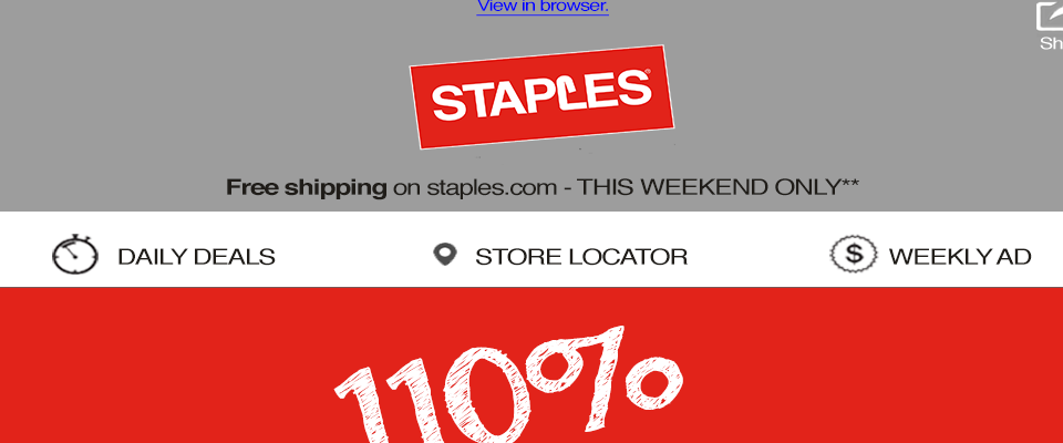
THE HEADER
Before I began sketching my design, I first looked at past emails I had received from Staples to get the idea for the type of foundation that is always found i.e. header, footer, and navigation. With a few emails found, I began to sketch my foundation, and started with my header first, designing the Staples logo at the center. Instead of having promotion text on both the top and bottom of the logo (as noticed in previous emails) I decided to include the link “view in browser” (as it was required for the assignment) above and leave promotional text for free shipping below. We were also asked to include a way for the user to easily share the email, so I decided to include this also in the header as an image icon in the top right.
NAVIGATION
With the header complete, I decided to work my way down the email and begin next designing the navigation bar. Based on the previously emails I viewed, they tend to have the daily deals, and weekend ad links as part of the navigation. In my design I included those two features as well to keep consistent with past emails the user might have received. However, I did add an additional link, store locator, so the user can easily locate a store if necessary.
THE FOOTER
At this stage in my design I skipped around, leaving the body of the email last, and began to focus on the footer. I’ve received enough emails to notice that the large portion of the footer contains the “fine print” as we will, but also houses contact information, and also a place where the user can unsubscribe from the email list if they no longer wish to receive them. I started with placing impromptu “fine print” text and knew I could expand this depending on how much text I needed. The next portion I added was the Unsubscribe button, as well as a witty tag line “you can always come back” that I noticed in a previous Staples email. Lastly I added their address at the bottom.
To me, the footer begins once the “body” of the email ends, so I am considering the next two sections as part of the footer. One email that I received from Staples highlighted the sections before the footer a place where the user can sign up for Staples Rewards as well as download their app and incorporate links to their social media sites. Since social media icons are usually found in the footer or the header, I decided to place that section right above my footer, highlighting again that the user can download the app or connect through one of three social media links. Above this section I also placed a spot for where the user can sign up for Staples Rewards. The design is based off of an email I have received from them before, again just trying to stay consistent to their previous material.
THE BODY
I left the body of the email last to design, and first began with the top portion which I wanted to be my focal point. This part of the body was to showcase the “110% ready” campaign that they are currently marketing. I added the “110% ready” large at the top and then followed it be two lines of text that is also noted on their website. I followed the text by images of school supplies available for purchase and finished the section with a “shop now” button. I also decided to add the dates the promotion is valid so it is known upfront and not hidden (that’s a personal touch and I don’t like it when “fine print” is hidden).
I separated the top portion with a horizontal line to begin my next design section. In my sketch I designed the bottom to contain a section to showcase how Staples goes about promising being “110% ready”, which is also noted on their website. But once I began designing in Photoshop I decided to remove the how to steps and incorporated two promotional sections, one that is currently being marketed by Staples and another that I made up. I designed them in a duel column creation in the bottom section; I then updated my “fine print” to be true to the promotions noted in the email. This section was the hardest to design, mostly because it had original content, and I played around with different material to promote.
FINAL TOUCHES
In addition to the email design I also decided to add a top portion, which would showcase how the email would look when it is opened. This housed a “from”, “to”, “date”, and “subject line”. This week I learned through article readings that the subject line is the most important body of text, because it might be the only text that the user sees if they decide not to open the email. The “from” should also be a name that the user knows, so I decided to not show an email, but just their company name, Staples. In conjunction, the “to” is the users name rather than their email to make it feel more personalized. This is than personalized further in the subject line where I call the users name first, followed by the promotion.
The last step was to bring the design together with color. The palette that I used are Staples’ traditional marketing colors: red, black, white, and gray. The color of the sections were chosen based on previous emails as well.
Below is my sketch followed by my Photoshop designed email for Staples back to school campaign:


This week’s assignment showed me all that goes into the designing of a brand campaign’s email, as well as which sections hold higher importance. I also feel as though I am able to grasp that once an email’s foundation is in place, switching out content can be easily done. Overall I really enjoyed this assignment, and was able to connect with the art of email designs.