Week 6 showered us with an overview of logos. You may be thinking, “But this is a Photoshop class Jen why would you create a logo in Photoshop?” Well, what if the company you are working for doesn’t have vector software like Illustrator, and only Photoshop and you have to create a logo for them, what do you do? I think it’s great that we are able to cover all our bases and get as much out of utilizing the Creative Cloud Suite as we can, not only in this class but in this master’s program.
Now back to this week’s lesson, logos; do you have a favorite logo? How about what do you think makes a logo great or successful? We were faced with these types of questions this week, oh and for me, I love the Tostitos logo. Not only is it a great representation of the company, while still being simple, it also has a hidden symbol; the T’s are two people sharing a chip (genius!). As far as what make a logo great or successful, everyone is going to have a different answer, but here are my top three reasons:
- First, it needs to be simple; you don’t want something over complicated. A person should be able to see your logo for only a few seconds to understand what type of message your company is trying to portray. Also, logos are used in many different ways, so if the logo is too detailed some of it can get lost in translation of being scaled or skewed.
- Second, easily memorable as well as recognizable. Your logo should be easy to remember, it if is too complex people may dismiss it. As this week’s reading notes, people should be able to describe your logo shortly after looking at it.
- Third a logo should be versatile. By making your logo versatile you are able to adapt it to any circumstance necessary. A successful logo should also have a grayscale as well as a reverse that works as well as the color option and be able to be scaled down if needed.
WEEK 6’S PHOTOSHOP ASSIGNMENT
With this in mind we look at Week 6’s Photoshop showcase assignment. This week we were asked to create a logo for one of two fictitious companies of our choosing. For this assignment I chose company A: a marketing and digital design firm located in NYC; start-up that is on a fast track for growth; target audience is obtaining high visual clients including major apparel and fashion brands. Because the two companies are fictitious we pretty much had free creative rang in any other aspect of the assignment as long as we met a few requirements, the most important being we had to use one of 50 logo marks that were provided in our logo design. I’m not going to lie I would have liked to have been given a company name since we had to choose one of 50 logo marks (which was difficult enough!). At first there was no logo mark that was sticking out to me, (company B was a non-profit green initiative company so naturally I saw leaves or trees in every mark, but I wanted to search deeper). Finally after two days of looking through the logo marks and researching online I decided on the one I wanted to design into my logo:
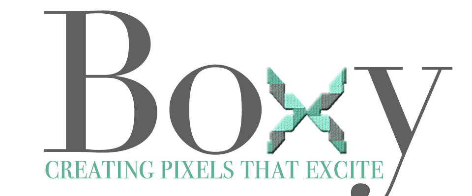
With a logo mark chosen it was time to decide how I wanted to incorporate this into my logo. When I saw this “box” as I call it I kept imagining the sides turned out into an “X”. Although company A has a much broader target audience than company B I felt as though I didn’t exactly want to create a picture logo, and in doing research of marketing and digital design company’s I noticed a trend in just type logos with a dash of an image here or there. With the box as an “X” fresh in my mind I decided to well convert the box to an X and use it as one of the letters in the company’s name, this would also make the logo simple and easy to remember. This required non other than me to browse the Internet for words with “x” in them. In doing so I also researched fashion words, as that was a noted audience and thought it would be a cool hidden meaning. In doing so low and behold I came upon the word “boxy”; with Vogue Magazines definition as “square in shape with minimal tailoring”. I thought the word not only connected to the audience but also to the type of business as well, how you ask? Well a digital design or marketing company creates images/designs for the web, and in designing for the web you create using pixels, pixels are squares, squares are boxes and with that awesome logic and connection I decided to name the company “Boxy”.
THE DESIGN PROCESS
With a name and a logo mark at hand it was time to start creating in Photoshop. Because the logo could also be used in print as well as web I decided to begin with a 300ppi canvas as you can always scale down to 72ppi but scaling in reverse would be difficult. First thing was first, I needed to separate my box and create my “X” shape. I did this by using the rectangular marquee tool and separating one half and then placing in on the other side of the other half. BOOM! I had an “X”! Typography was the next obstacle I decided to choose a serif as I wanted to emulate a “Vogue” typography look which to me says “I’m professional yet edgy”. After first having a thick font, and just deciding it looked too rounded, I stumbled upon Didot Regular, and knew I found my match. A serif font also reminds me of attention to detail and that is an attribute that company A would have.
THE TAGLINE:
The tag line; this little number and me definitely did our dancing before creating the perfect slogan. I knew I wanted the tag line to give a little sense of what Boxy’s objective was from a company standpoint but I kept feeling that I needed to incorporate the fashion brand target audience more. After much debate in my head I concluded that a fashion brand isn’t going to not choose company A to design for them because their slogan isn’t in touch with their fashion brand’s business purpose; after all Boxy is a digital design and marketing company. With this realization becoming more and more vivid, I decided to incorporate the word “pixel” in the slogan as that is how I originally decided on the “Boxy” for the company name. With as many words as possible fluttering around in my head I asked myself “what does Boxy do?” They create, ahhhh, they create designs, oh wait, lets go further, they create pixels! Boom! Two words down, but I knew I couldn’t just end the tag line there. Thinking harder I asked myself what is Boxy’s end objective, to excite through visual images, and voila “creating pixels that excite” came to life!
ADDING COLOR:
Color was one of the last attributes that I touched in the logo design, mostly because I had no idea where I wanted to go with color. I knew I didn’t want to just do a black and white logo mainly because a digital design/marketing company would be one that is full of life and color. Another dilemma was that I wanted the “X” to pop especially since it had different section I knew I could apply multiple colors. Because of this I decided to create “BO Y” in a dark gray, and then make the tag line and “X” a pop of color. I decided on a fresh pop of mint green to compliment the gray perfectly, however I couldn’t go too light on the mint as that would make the wording hard to see on a white background, but too dark would make the words lost if the logo was to be reversed. Ultimately I decided on two shades, the darker being #5FB298, and the lighter #9BECD5. The lighter gray in the “X” image was just a lighter version of the gray in the typography of “BO Y”. In placing the color in the X this reminded me of a piece of fabric in the wind which I thought was almost majestic like (there I finally got my fashion reference!) I didn’t want to add any style layers to the typography as to not take away from making the “X” my focal point so in order to give it a bit more depth I decided to a Bevel & Emboss with a texture of woven to give it more of a fabric appeal. In order to have the tag line stick out I decided to take the darker of the two mint green colors and chose that for the tagline color (which I think made it stand out all on its own without taking too much away from the “X”). The final logo design is below:
ALTERNATIVES:
In order to see if my logo was designed successfully and able to adapt to different circumstances we were asked to create it in gray scale as well as reverse, below are those images:


Boxy’s logo design is equip to handle a gray scale or reverse image if needed, as well I think it would be able to handle other various formats such as a transparent background as well as in the extreme case of embroidery (as the font is thin enough and there are only three colors to the design). Thinking ahead for Boxy in terms of expansion within the business, we would be able to add the location of the company, if expansion in terms of location happens, on top of the “y” in Boxy as shown below:
 Considering the type of business, if divisions between marketing and digital design occurs due to business expansion hey would be able to either supplement the division name either in place of the location or in place of the tag line if the tag line is no longer required. A change in tagline could also be accommodated as long as it is not increasingly long as intersecting with the “y” would be the issue. If it were to be longer though a portion of the tagline can be used on top of the lower case letters on the same invisible line as “New York” allowing that there is enough room between it and the “oxy”, the remainder of the tagline and then replace its current position underneath.
FINAL THOUGHTS
Successful logos are simple, relatable, easy to remember, and versatile, but I never really thought about just how much detail goes into creating them until I needed to create one myself. Although this assignment, at least for me, didn’t utilize a lot of Photoshop tools and adjustments, it was great to see I would be comfortable taking on the challenge of creating a logo in Photoshop if needed!