 Week 3 of VIC5325 brought on the topic of the adjustment panel as well as masks. Currently if I wanted to change the color of a photo to Grayscale for example I would simply go to image-> mode-> Grayscale. “Perfect I was able to achieve the look I was going for so I will save it”. ::5 Minutes later:: “Actually I like the photo in color better, let me go back.” Unfortunately because I went the route of changing the image to Grayscale through the image window I am unable to retrieve my original photo because I saved over it. :: insert angry grunts:: We learned this week that you can use the adjustment panel to make any changes that you wish to your image while still being able to maintain an original copy which can alleviate a lot of stress and frustration down the road.
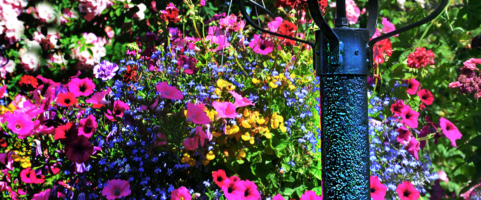
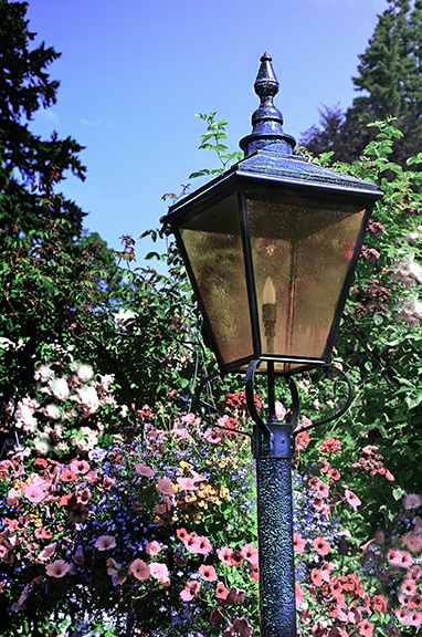
Week 3’s design showcase assignment was to choose one of three images that were given to us to adjust and mask as per the assignment requirements. The requirements for the assignment were as follows:
- Adjust the height of the image size to 8 inches
- Clone some additional flowers into your image
- Create an adjustment layer of your choosing except for black/white
- Mask an area of your choosing
- Use at least one: Dodge, Burn, Sponge
- Use at least one: Blur, Sharpen, Smudge
- Create an additional adjustment layer using black and white. Adjust the opacity of this layer
FIRST LAYER EDITS:
We were first asked to change the size of the image and were required to change the height to 8 inches if vertical. This was achieved using the image window->image size and then adjusting the height in inches. Our first editing adjustment was to use the clone tool to add additional flowers to our image. First, I duplicated my original unedited layer so that I could preserve it in that format, then I looked at the image to decided on spots on which I thought were “bare”, I decided on the right of the lamp and the bush towards the left of the photo. I then used the clone tool on the duplicated layer to add flowers within their respective region on the image to make those areas look fuller. For example, because the bottom right area of the image has some shadows I cloned in flowers that were shaded darker from the left side of the image so that the newly cloned flowers on the right didn’t look out of place. Within the same layer I also used the sponge tool on the lamppost to brighten the saturation of the dark exterior of the metal. This in turn created a blue appeal which I thought complemented the ski color yet stood out all on its own making it a prime focal point of the image.
SECOND LAYER EDITS:
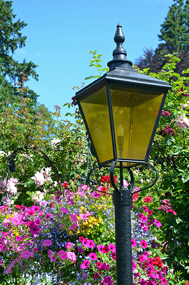
In continuing with the requirements, my next edit used the sharpen tool. Before I began using this tool I added another layer that way if I wanted to go back and edit the sharpening of the image I knew exactly where I did this. I decided to use the sharpen tool to enhance the pixels on the lamppost. In doing this a light blue/aqua texture was enhanced on the post, to balance this edit I also applied this technique to the top portion of the lamp as well. Within this same layer I also used the dodge tool to lighten the “yellow” glass of the lamp. Although the glass of the lamp is meant to be yellow in color, I knew that I wanted to lighten it to enhance the lamppost, this was achieved using the shadows selection in the menu bar. In doing this I realized that if I lifted my mouse while applying dodge over the glass and then clicking down again it applied another layer on top of my first layer, so in order to create a seamless layer of color I had to use the tool in one click without lifting up.
THIRD LAYER EDITS:
For the adjustment layer I chose hue/saturation which enhanced the colors of the image. A mask was then used along with the gradient to hide certain pixels based on the gradient direction since black was chosen as the foreground color, this created enhanced shadows in the image. Within the same layer I also decided to blur the background flowers in order to let the lamppost pop a bit more. When looking at the lamppost I still felt as though the yellow glass should be more see through, it currently looked like it went through a pollen storm, so to make the glass look a little clearer, I used the dodge tool again to lighten it.
FOURTH & FINAL LAYER EDITS:
I decided to play around a little bit and add another adjustment layer of hue/saturation and it really made the colors pop but I wanted to tone down the colors just a bit. I changed the saturation to -30 and chose lighten from the layer panel. Below is a side by side comparison between the original, and the final image.
Original image

Final edited image
Our last requirement was to add the black and white adjustment layer and decided on an 83% opacity, this in return gave the photo a vintage feel:
Final image with black and white adjustment
This week’s lesson was fun and challenging as we learned new tools and panels, I am excited to further use these concepts to enhance future images. Below is a larger version of the final image:
The final edited image