
Image courtesy of Comfi’s Facebook Page
** Disclaimer: I am in no way affiliated with Comfi, this wireframe was created for educational purposes.
Wireframing, which is a visual blueprint of a website, made headway as our discussion topic for week 8. Personally I think that wireframing is a needed process in web design because it allows you to establish, focus, and plan out, the most important information. In this fundamental step there are no color or glitz and glam, so you are able to understand the structure of the site and how to get the end user to find the end result as quickly as possible. Wireframing is simplistic so this beginning process allows the designer and the client to work through the importance of the site and the hierarchy of information without getting distracted by color, fonts or photos; which can also save time and money in the long run.
THIS WEEK’S SHOWCASE ASSIGNMENT
For this week’s showcase assignment we were asked to design a wireframe for our favorite restaurant’s website. I decided to choose a newly opened breakfast/lunch café near my house called Comfi, not only because they have delicious food, but also because they currently do not have a website. As with all of our showcase assignments we had some requirements, we needed to design spaces on the wireframe for:
- Logos
- Navigation menu
- Social media icons
- Rotating slideshow image
- Upcoming events/specials
- Three feature areas
- Contact Us area
- Another feature area of our choice
MY DESIGN THOUGHT PROCESS:
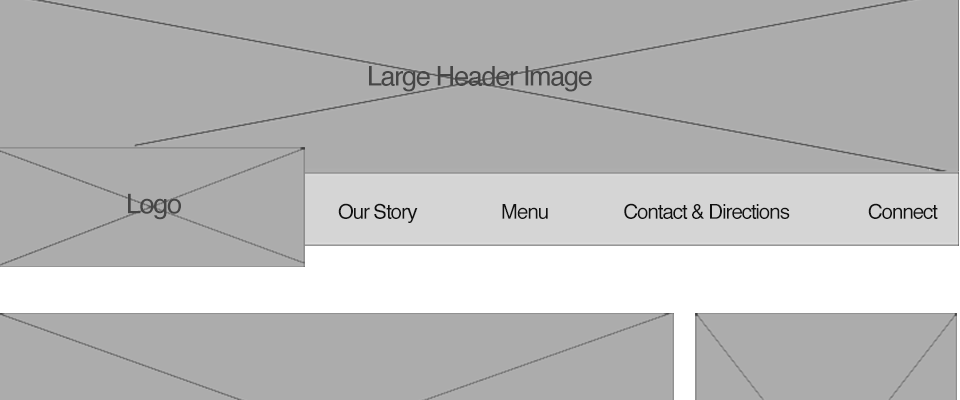
First I began by thinking of the different pages that would link from this main page to see how big of a navigation menu I would need. Based on their social media pages I decided on four: Our Story, Menu, Contact & Directions, and Connect (which would show social media links and possibly posts). With this information I then began to design the header, which consisted of a logo, the navigation bar, and a larger top photo. I decided to use a top photo because currently Comfi does not have a logo (they just use their current storefront sign) and I thought an image of the inside of their café would seem inviting.
THE FOOTER:
With a header in place I decided to then work on the footer, which is where I would place the contact us area, as well as social media icons (and also a second spot to access the navigation links). I positioned their contact information on the left, as our eyes first read from left to right, and then positioned the social media icons on the right underneath another set of navigation links for ease of access.
THE BODY:
It was time to focus on the body of the website which is where majority of the information would be housed. Since we needed to incorporate a slideshow image I decided to place that first, and let it be the largest aspect underneath the navigation menu, primarily because Comfi loves to take photos of their awesome menu creations and I thought it would be a great focal point. At first I had thought and sketched it being as wide as the header image but afterwards decided to shorten it so I could add a right side panel which would later house additional sections (below are two alternate wireframe sketches followed by the final product).
 Alternative Sketch 1 (above with the specials section on the left of the slideshow image and the social media feed on the right. In the end I felt that the slideshow should have precedence over the specials and moved them over to the right).
 Alternative Sketch 2 with slideshow image stretching the whole page and the specials and social media feed separated on either side of the three feature area. (above)
 Final Sketch (above)
Below the slideshow image I placed a section where Comfi’s could display their hours, since they are not open on Mondays or past 3pm. This would allow customers to easily be able to see the hours without having to search the website or leave the homepage.
One of our requirements was to incorporate three feature areas, and I decided to create the areas based off of the navigation links. Since the contact information was already placed in the footer, and the connect link was a little harder to portray, I decided to use two of those areas as an overview for the “our story” and “menu” link, which left one more area to create. Comfi’s is considered to have an American, Polish menu, and some of their favorite dishes include one of my favorite foods, perogies. In fact, on their social media sites Comfi, time and again, has posted about how much they love perogies; so I decided to create the third area to highlight their favorite food.
Since I left room on the right side for additional area I decided to place the specials as well as my additional feature (social media feed) on there, which would make the slideshow image, the first line of sight in the body followed by the three-feature area (as I thought those were more important). The specials area would be a section where Comfi could list either any monthly special menu items or any new items respectively. As I mentioned before Comfi loves to take photos of their menu items, but they also are very active in posting through their social media sites, which is, how they connect and communicate with their customers currently as they don’t have their own website. Because they depend so heavily on social media I decided to design a section that would house social media posts and for the purpose of the wireframe designed it for their Twitter feed. The social media feed would display Comfi’s most recent tweets/retweets and possibly any tweets from customers that they are tagged in.
COLOR SCHEME
With my wireframe design complete, I turned my focus to deciding a color scheme for the website. As I mentioned previously, Comfi is a newly opened café, without a logo, and just an online presence on social media. Because of this they do not have a set style guide, so in choosing a color scheme I decided to take color from a photo of the inside of their café.

Image courtesy of Comfi’s Facebook Page

Photo of front menu courtesy of Comfi’s Facebook Page
The overall feel of the café is very warm and inviting, and so the colors I chose out of the photo to use as accent colors were:a warmer pink color, a green that they most recently used in their redesign of their menu, and then a lighter green that is painted on their walls. Since the website needs a background color I chose a softer beige, and also picked a dark gray for the text options as black is too heavy on the eyes. Below is the final wireframe:

Overall I believe that the wireframe I designed for Comfi’s is exactly what they need for their website debut. The site houses all of their necessary information while still maintaining a warm inviting feel through the color scheme.