In our last week of class, our focus turned to lighting and 3d effects in Photoshop. Once again, all that this program can handle and accomplish surprised me! I can think of multiple occasions were I couldn’t utilize a photo as I wished because it was too dark or too light, and to think all I needed to do was add a lighting effect!
For our final showcase assignment we were asked to design a holiday eCard that UF can send out. Since most of my designs this semester dealt with either summer or fall campaigns I decided that this assignment would focus on the winter holidays, more specifically Christmas.
WHERE DID THIS DESIGN COME FROM?
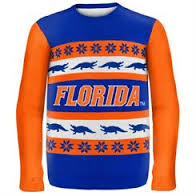
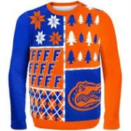
For some reason after I decided on Christmas I immediately thought of those ugly Christmas sweaters, and in doing a quick Google search came across some “pretty” ugly sweaters. I then remembered that I had previously viewed team and university sweaters and went on a hunt for a UF one, and low and behold I found a few designs!
HOW DID I MAKE THIS HAPPEN?
I wanted to recreate my own take of the crazy design and place that on an eCard as if it was a ribbon going horizontally across. I found a template of a pretty eCard design that had a similar layout and used that as my background template. My next mission was to search graphics that I could use in this design, so I searched for silhouette Christmas (Christmas tree, present, holly leaves etc.) and UF graphics such as a gator, and UF logo. One by one I went and placed them sporadically on my canvas using the template as a guide.
COLORS
Originally I had planned on the background being white and having blue and orange icon images however, I decided to go all out colorfully for this project and chose orange as the backdrop with blue icons (some with no fill so orange could show through). In doing this, I knew to contrast the orange I had to make a blue background and thought if I could recreate a sparkle/slight snow effect that would make it pop. I added noise to the blue background to make this effect come to life.
LIGHTING
Finally we were asking to add lighting to our design so I implemented a large point effect first to brighten up the colors and then an infinite light to soften them so they weren’t “so” bright.
FINAL THOUGHTS
Honestly, I’m getting a little sad thinking about how this is my last showcase blog post, but even sadder thinking about how this is my last Photoshop showcase assignment for this class. It is amazing how much I have grown and developed as a designer in only 13 weeks. I am so proud of how far I have come since my first BLT sandwich and look forward to implementing the skills learned this semester in future projects.
