

Calendar page redesign: making the first impression count
GoodLife45 is a Florida TV broadcasting station. During my first week as their web design intern, I identified a confusing hero image experience on GoodLife 45’s calendar page and took the initiative to redesign it, translating verbal feedback into visual mockups that were approved by both my supervisor and the CEO.
A self-initiated project in the first week
During my first week as GoodLife45’s web design intern, my supervisor asked me to explore the site and list the changes I’d make if I were in charge. The calendar page was high on my list.
When I started sharing my suggestions verbally, I quickly realized my ideas weren’t landing. Rather than give up or continuing to talk about it, I took it upon myself to design mockups that would show what I meant, letting the visuals communicate where words couldn’t.
A hero image raising more questions than it answered
The calendar page had a solid overall layout, but the hero image experience was creating friction. The font color, content placement, and call-to-action button were generating questions you never want a user to ask:
“What is the date for?”
Date information overlaid on the hero image without clear context
“Why is it blocking the image?”
Content placement obscured the hero visual without adding meaning
“What does the button do?”
The call-to-action lacked clear labeling and purpose
“What are these events?”
Event listings below lacked enough context for a first-time visitor
As Steve Krug would say: “Don’t make me think!” but the hero image was doing the opposite.
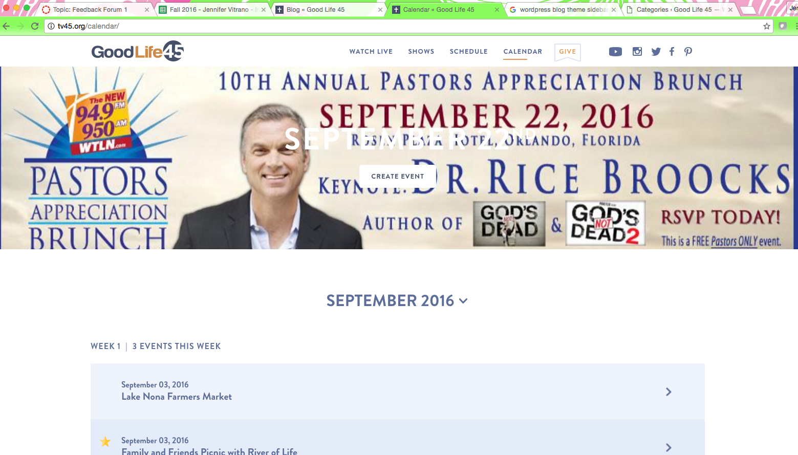
Original Calendar page, notice the hero image.
Design first, communicate second
Created in Photoshop, I designed a top bar to house a clear page description and call-to-action button. This removed the need for content placement over the hero image, particularly important since the image changes with different events. The color and typography stayed on brand, pulled directly from their existing style guide.
The solution was intentionally simple: separate the navigation context from the image, give the CTA a clear label, and let the hero image do what it’s meant to do: set the visual tone without competing with information.

Redesigned mockup with dedicated CTA banner, and not text over images.
From mockup to code to deployment
The mockup was welcomed and praised by both my supervisor and the CEO. GoodLife 45 works with a contracted outside web development company, so implementation meant working directly with their developer rather than building it myself.
To make that handoff as seamless as possible, I went beyond just sharing the approved design. I wrote the HTML and CSS needed to implement the change, giving the developer everything required to execute with no ambiguity or back-and-forth. This was my first experience communicating directly with an outside developer, and it taught me that a good handoff is as much a design deliverable as the mockup itself.
Where it began
Communication is key, and sometimes the most effective kind is making something tangible. Early in this internship I learned that showing a concrete solution is almost always more effective than describing an idea. It removes ambiguity, focuses the conversation, and gives stakeholders something real to react to. I also learned that self-initiating, seeing a problem and proposing a fix without being asked, is how you stop being a passive intern and start being a designer.