

Blog page redesign: from peer feedback to stakeholder sign-off
Building on my calendar page redesign for GoodLife 45, I tackled their blog page next, a page that had been deprioritized in the previous site redesign. I created multiple mockup versions, gathered peer feedback, iterated based on suggestions, and walked the final design through stakeholder approval all the way to the CEO.
A page that got left behind
Following my calendar page redesign for GoodLife 45, I turned my attention to their blog page. My supervisor acknowledged it had taken a hard cut during the site’s previous redesign. The web design lead at the time hadn’t prioritized it, and the result was a page that started strong and quickly fell apart.
The page opened with a compelling large blog header image, but once users scrolled past it, they hit a wall of purple text links with no labels, no hierarchy, and no affordance that would tell a first-time visitor what they were looking at.
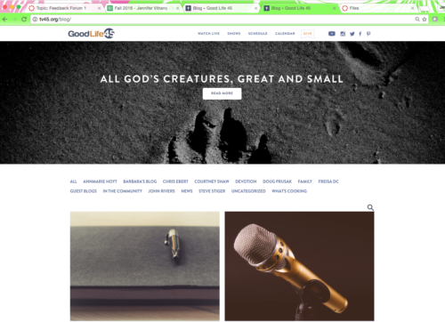
Original blog page, would you know what the text was for?
Users getting lost after the hero
The core problem was discoverability. The category links were styled as plain purple text with no surrounding context. There was nothing to tell a user unfamiliar with blog conventions that those were navigation categories. Traditionally categories live in a sidebar; here they were just floating mid-page with no visual treatment to indicate what they were.
The search bar was also buried, making it hard to find for anyone who wanted to locate something specific. The page had the bones of a good blog experience but none of the scaffolding that makes it usable.
Multiple versions, one goal: make it scannable
I created two initial mockup versions to explore different approaches to the same problem. Both stayed on brand using the existing style guide.
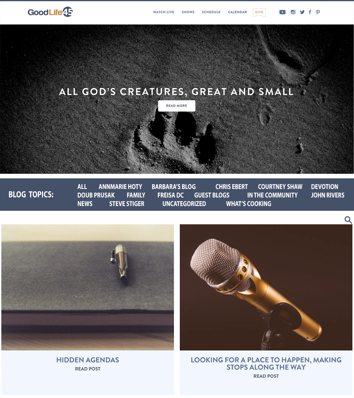
Mockup 1, adding context to the section
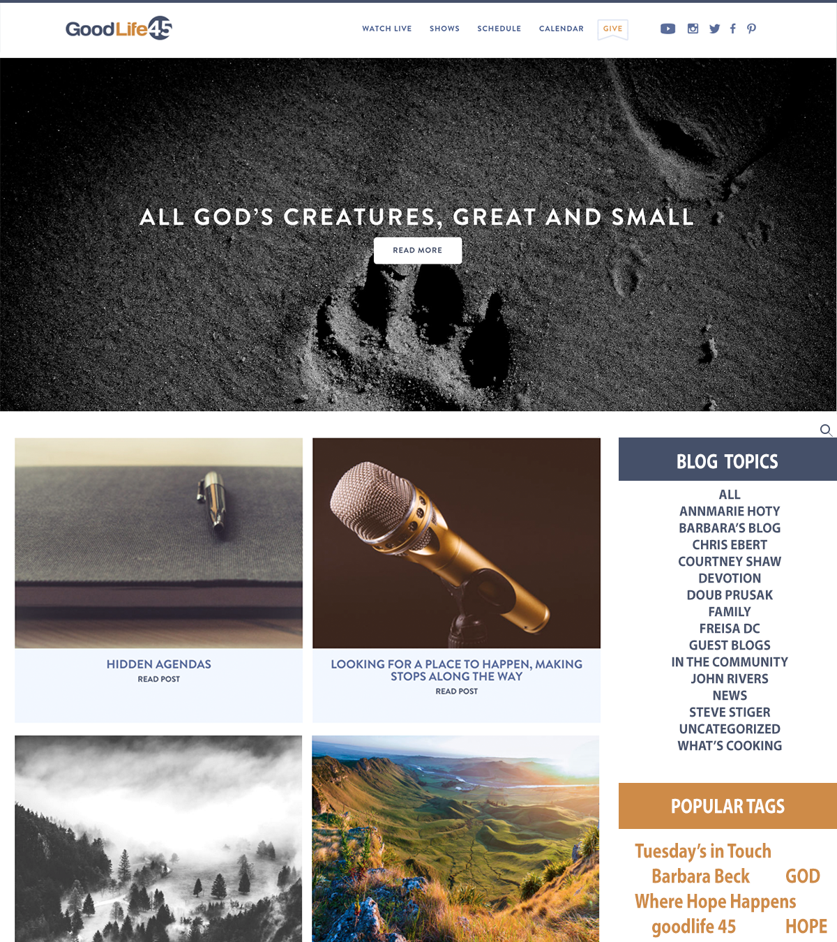
Mockup 2, redesigning the page
Don’t be afraid to ask for feedback
I presented both versions to my internship classmates for critique. The sidebar approach was the clear favorite. It felt more familiar and gave users a stable anchor as they browsed content. One classmate suggested adding a social media section to the sidebar, which I hadn’t considered. It was a great call.
I incorporated the social media links into a third version and brought all three mockups to my supervisor. She approved the third version and introduced it to the CEO for final sign-off. He approved it too.
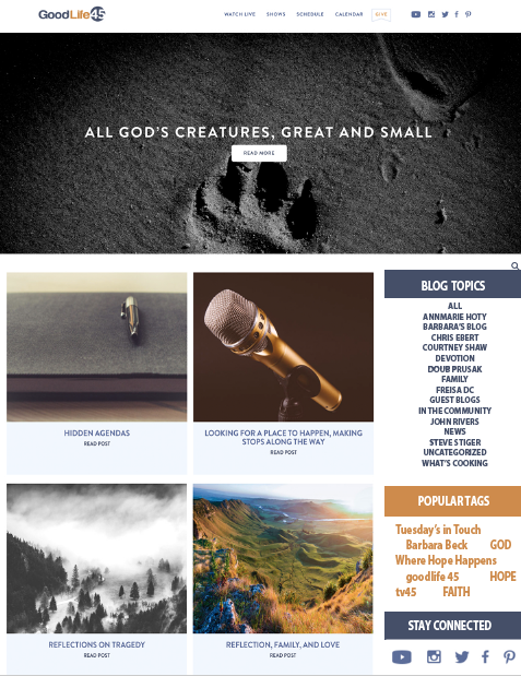
Mockup 2, with incorporated feedback.
Stakeholder sign-off and developer handoff
Once the design was approved, I handed off the final mockup to the team’s web developer, who coded and deployed it. The blog page went live during my internship.
What it was teaching me
This project reinforced something I believe now more than ever: don’t skip the feedback step. Because I asked my classmates before presenting to my supervisor, I caught the social media gap before it became an obvious miss in the room. That small investment of time before the formal review made the final presentation stronger and made me look more thorough. I’ve carried that instinct into every project since, get eyes on it before it counts.