
MY ROLE
Mockups, UI elements, stakeholder interview
PROJECT OVERVIEW
Going off of the first UX project I created for myself as a web design intern with GoodLife 45, in which I created mockups to enhance page flow, this deliverable focuses on enhancing user experience on their blog page.
MY APPROACH
I analyzed the layout of the site. The page starts out strong with the large blog header post image, but then the user gets lost coming across links without a title and someone without prior blog interaction, could have no idea that those are categories, as traditionally that is located in a sidebar fashion. My supervisor noted this page that took a hard cut when it came to the website redesign and didn’t receive the same care and attention as web design lead didn’t think that a blog page was as important.
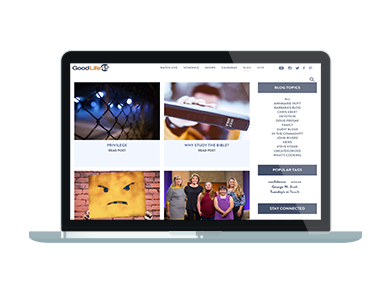
Below is a screenshot of the blog page (minimized slightly to show most aspects). Would you know that the purple text are link categories?
MOCKUPS
I created multiple mockup versions to demonstrate page flow improvement. The color and font used were on brand from their style guide.
Version 1: This version adds a border background to the categories and a title to describe what the links are.
Version 2: (Utilizes a traditional sidebar layout to house the category links and added in tags. I relocated the search bar to the top of the sidebar to be accessible to the user at all time as the sidebar would remain static.
I presented the above mockups to my internship classmates for feedback. My design process was welcomed and the second version was most accepted. It was suggested to integrate a social media section which was a great idea! I added the social media section to version 2.
Version 2.1 – updated
IMPLEMENTATION
Both versions were presented to my supervisor who agreed with the suggestion that the sidebar is most appropriate and user engaging. The mockup was updated so that the whole sidebar is the darker color (as well as a font update). The mockup was signed off along with the CEO. I then worked with their contracted third party web developer to communicate the page update.
WHAT I LEARNED
Don’t be afraid to ask for feedback from fellow designers! Because I asked for feedback from my classmates on the mockups, I received the recommendation to add the social media section which was not something I thought about previously.
EXPERIENCE GL45’S REDESIGNED BLOG PAGE HERE!