** I am in no way affiliated with the authors of this article in anyway shape or form, this design was created for educational purposes. **
We’re down to the wire, and this week we learned how to use the pen tool in Photoshop; a tool that might be better known in a program such as Illustrator. However, the pen tool in Photoshop is helpful as you can use it to create layer masks, or to create a stroke as I did in my showcase assignment for this week.
This week we were asked to design an infographic based on one of two articles given, I chose Article B, Fun Cheese Facts for National Cheese Day because I thought it was a more fun topic and I liked that this article had more categories as I wanted to create a vertical design (plus I have an addiction to cheddar cheese, its only mild though .. ba dum chhh).
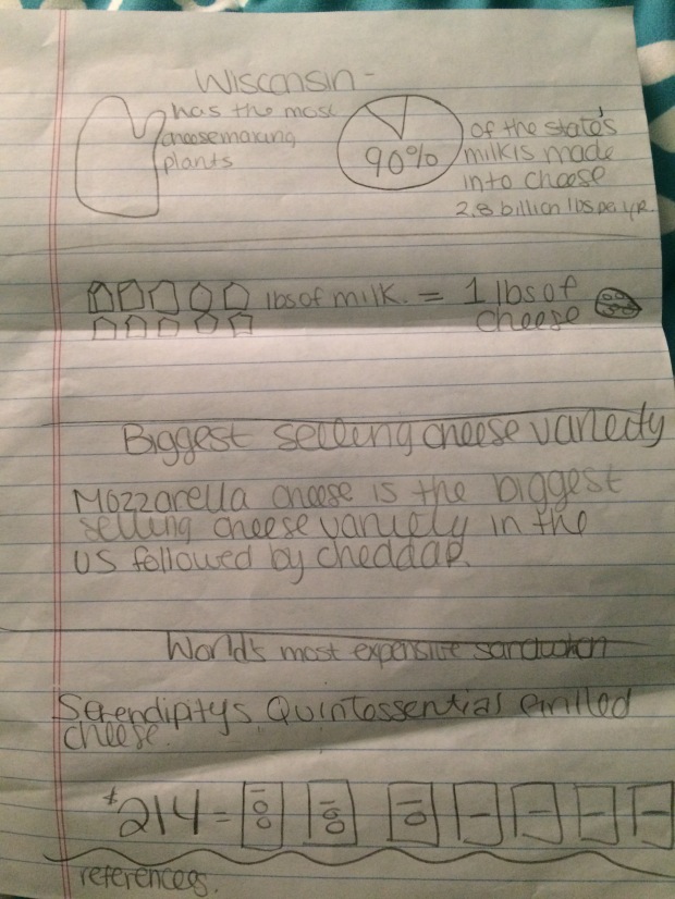
Before taking to Photoshop I sketched out what I was thinking of displaying for the facts as I went line by line through the article. Below is the visual of my brief wireframe: (you will notice there are some aspects that I did end up tweaking once looking at my final design)
FIRST APPROACH
Although the above was a brief sketch I then took to Photoshop to make those designs come to life. I went section-by-section and not bothering with color or typography yet just placed my idea on a canvas. After, I was a bit stuck as I wasn’t exactly sure how I wanted the overall design to look, so I took to Pinterest for some inspiration. I searched Cheese Infographics first, but only came across life like photos and designs. I have always loved more cartoon/distressed/retro designs so after feeling like I struck out with that search I began a new one, this time simply typing infographics in the search box. I came across this design about Coffee Facts that I particularly liked as far as their color choices and graphics and decided to use this as my inspiration.
COLOR & FONTS
Now that I had some inspiration I started to feel a little more at ease with this assignment and began to focus on colors now. I wanted to stick to a very basic color pattern and decided on: dark gray, light gray, a light yellow (as seen in the background), and a lighter orange (to symbolize cheese). Next I turned to search for fonts to bring more creative spark, and I found that in Emmenthaler on dafont.com as this font in particular reminded me of Swiss cheese. I also chose just a simple san serif font to balance out selecting Helvetica Bold.
RE-DESIGNING
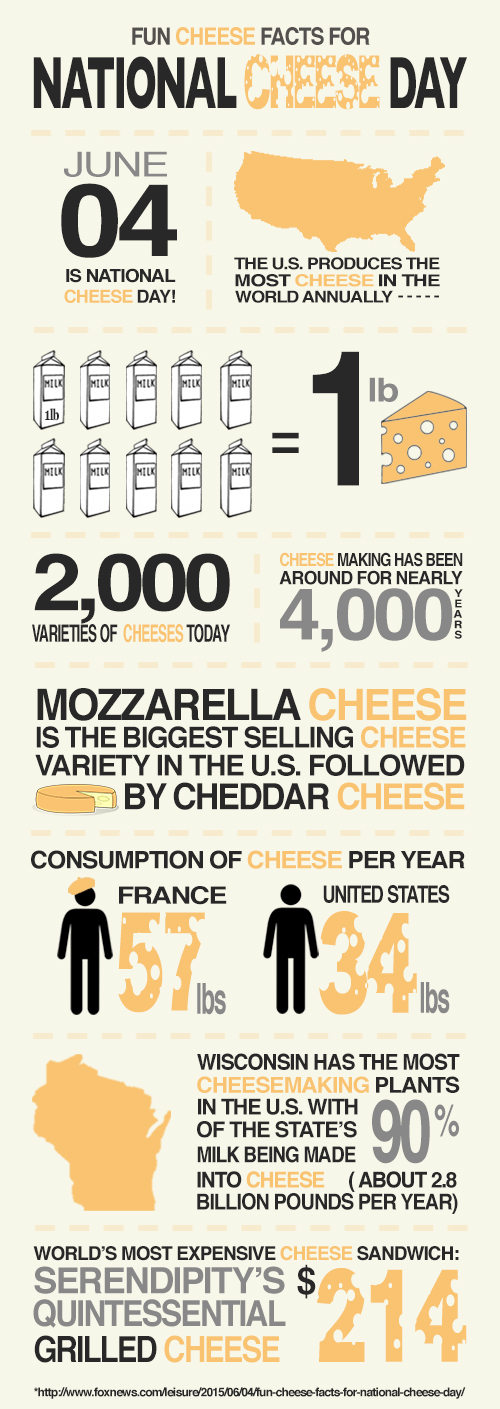
With somewhat of a plan in place I then went back and re-focused on each section to re-design it so the whole image is cohesive. I started changing aspects from my original wireframe sketch when I realized that certain categories didn’t have enough information to have its own line section. For example in my sketch I had the National Cheese Day text with an image of a calendar on its own line, but once I found an image and arranged the text I realized that it was just too little of information to be able to fill up the space I wanted it to. So instead I transformed the data into a text design and shared the space with another fact. The only other category that in the end differed from the original sketch was the “Cheese making has been around for nearly 4,000 years”. Originally I had planned on having a timeline, but found it hard to depict such a broad span of years and found myself repeating the wording in the text and through the design, so instead I created a “text design” and shared their space again with the number of variety of cheeses.
Another aspect of my design that is prominent throughout is that I decided to make the word “cheese” the same light orange throughout the image, which I thought helped to make the word pop in the facts. As well, I designed certain words/facts to have a different font or color to make them stand out so the whole design isn’t boring. I also rearranged the sections so they aren’t in the same order that you read about them in the article. I did this because some sections had 2 facts per line and I wanted the layout to differ from section to section, so based on how many facts or the icons in the section depicted where they came in the design (as well I wanted the icons balanced throughout).
Finally, I used the pen tool to section off the first category to show which facts belonged together as to not confuse the user. I choose a softer orange so that it was visible but not distracting. I then duplicated the pen stroke and sectioned off each category following as well. Below is my final design:
Although I didn’t utilize the pen tool as much as I wanted I feel comfortable knowing the capacity of the tool as well that I can use it for more than just shapes. I am very pleased with my infographic design and think it definitely came a long way from my original wireframe sketch.


