
** Pizza Planet Style Tile was created as a project in Advanced Web 2 during my studies towards my masters in Web Design and Online Communication through the University of Florida. Many of the aspects in this site were required per project requirements and was created for education purposes. I am in no way affiliated with Pixar or Disney.**
At the end of Advanced Web 2 we faced our final project to design and develop a responsive, mobile first, website for a fictional restaurant. We were asked to select the restaurant from a list of places that ranged from The Leaky Cauldron from Harry Potter to Gusteau’s from Ratatouille. I based my choice on which restaurant I could have the most fun with, Pizza Planet from Toy Story. All of the colors, graphic images, interactive elements flashed before my eyes of all the possibilities with this site.
OBJECTIVE
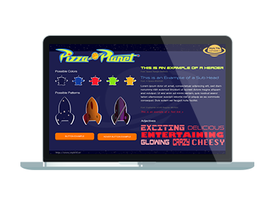
The first part of our final was to create a style tile and style prototype for the restaurant in which all of the deliverables are true to the spirit. A style tile consists of typography, color, and any interface elements that clearly communicate the direction of the visual design process for a site. Presenting a style tile helps to determine if you and your client are on the same page and will save you time in the long run rather than designing multiple theme mockups. Style Tiles is a great web source for more examples and templates on style tiles.
STYLE TILE DESIGN PROCESS
Beginning the design process for Pizza Planet I researched any current branding the fictional website has in the movie. Pizza Planet is a “out of this world” family restaurant and arcade which is frequently visited by characters of the movie. The restaurant is space themed notably in not only the architecture and arcade games, the building is shaped as a planet with a rocket on the side and all games are space themed, but the color scheme is dark with neon elements.
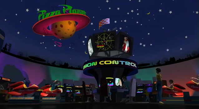
Photo source: pixar.wikia.com/wiki/File:Pizza_Planet.png
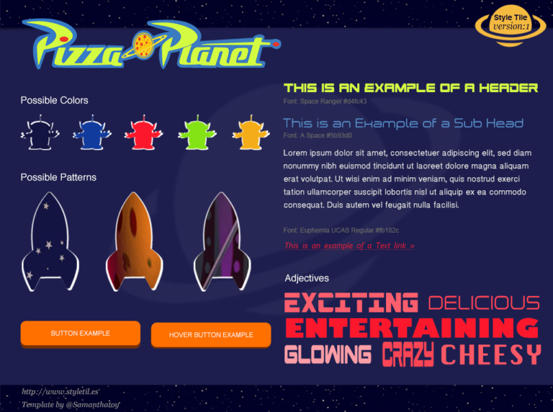
LOGO & COLOR
Hollywood Studios in Walt Disney World Orlando is home to a brick and mortar Pizza Planet which is loosely themed to the movie. Since a distinguished logo had already been established, I used this as the focus and basis for my Style Tile. The bright neon colors of the logo were established as the template colors. Neon blue, neon green, neon orange, and red; because of the darker interior I decided on a fifth template color, dark blue which would resemble a dark starry night sky. Since Pizza Planet is a fun family restaurant and arcade instead of showcasing the colors on the style tile in a standard shape I decided to present the possible colors in alien silhouettes.

Pizza Planet Logo, Hollywood Studios Florida. Source: diningatdisney.com/toy-story-pizza-planet/
TEXTURES/PATTERNS
Displaying textures and patterns on a style tile help to communicate a visual starting point; items such as gradients, background imagery, patterns etc. I decided on 3 images that I selected from the movie imagery: a starry sky background, a texture of a “pizza planet” you can even see the mushroom shaped topping if you look closely, and pattern that is circles and lines with futuristic flare. To stay consistent with the aliens silhouettes and to showcase more for of the visual elements, I presented this section of images within rocket silhouettes.
BUTTON EXAMPLES
In designing the button example for the style tile, I wanted there to be an interactive element and not just a static button click. Thinking back to the spirit of the restaurant, the first thing I thought of was an arcade button, and the motion of when pushing the elevated button it moves downward. This is displayed on the tile so when the user hovers over a button it creates the pushing motion. A bright neon orange was selected so that they are catching and not missed.
TEXT EXAMPLES
Moving on to text examples, I not only wanted the typography to stay in line with the spirit of the site, but I also needed to display text that was fun yet legible and wouldn’t strain the users eyes. Upon researching I decided on Space Ranger for the header and A Space for sub header, and to offset the headers, a san serif typefaces was chosen for the content, Euphemia. The color red was chosen as the link color in order to bring the users attention to them.
Additionally, adjectives are added to a style tile to help display the emotion of the website. The adjectives chosen were: exciting, delicious, entertaining, glowing, crazy, and cheesy. Remember this is a family friendly arcade restaurant so we had to make sure all of the bases were covered.
PRESENTATION
The layout was created to best display all of the elements of the style tile in a presentable fashion while allowing each section to be its own star of the show. A starry skied header and footer was added to draw your eye to the content. Additionally 2 subtle planet “easter eggs” were added: a low opacity purple planet in the background of the main content and in the top right corner as an fun element to display the style tile version. Below is the final layout of the style tile:
STYLE PROTOTYPE
After the style tile was designed and finalized we were responsible for bringing it to life through a style prototype. The prototype is an in-browser representation of the brand’s visual language in a responsive setting created with HTML and CSS. The elements as described in the static style tile here, are interactive. The client is able to see the hover elements of the buttons, links, and images. Click the image below to view the style prototype.

To view the final full responsive website click here.