
MY ROLE
As part of the White Owl Designs team: target audience, creative brief, informational flyer, wireframes, usability testing, and post/section page development. Each project we rotated as team lead.
CLIENT OVERVIEW
For forty years, Tower Hill Insurance Group, or THIG, has been a provider of insurance services for personal and commercial property. THIG is the largest writer of homeowner policies in Florida, with over 400 employees and soon expanding to four additional states. The coverage products that are provided include flood insurance, rental insurance, condo insurance and home insurance.
PROJECT GOAL
To design and develop a customized, responsive, and accessible, WordPress theme that meets brand guidelines and theme requirements.
OUR APPROACH
In order to understand our client’s current situation, beyond the stakeholder presentation, we conducting a thorough situation analysis using cited secondary information. The contents of the analysis include: organization overview, target audience, industry analysis, competition, general communication strategy, and SWOT analysis.
THIG’s target audience are homeowners, renters, and commercial owners generally between 35 and 64 years of age, with a median income of $75k+ that reside or own property in Florida. Activities of the target audience potentially include: fishing, surfing, cycling, swimming, and reading; as they have an active lifestyle. Their target audience has an active social lifestyle, both in person and online, as well as a positive attitude towards trust and the ability to build and maintain relationships.
You can view my teams entire situation analysis here.
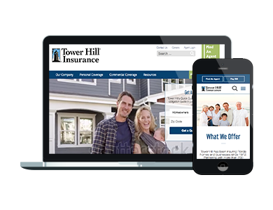
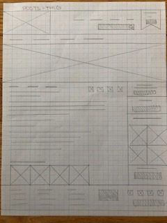
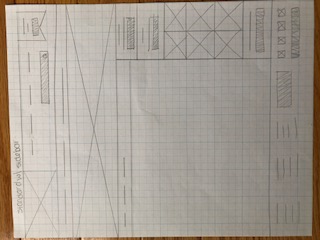
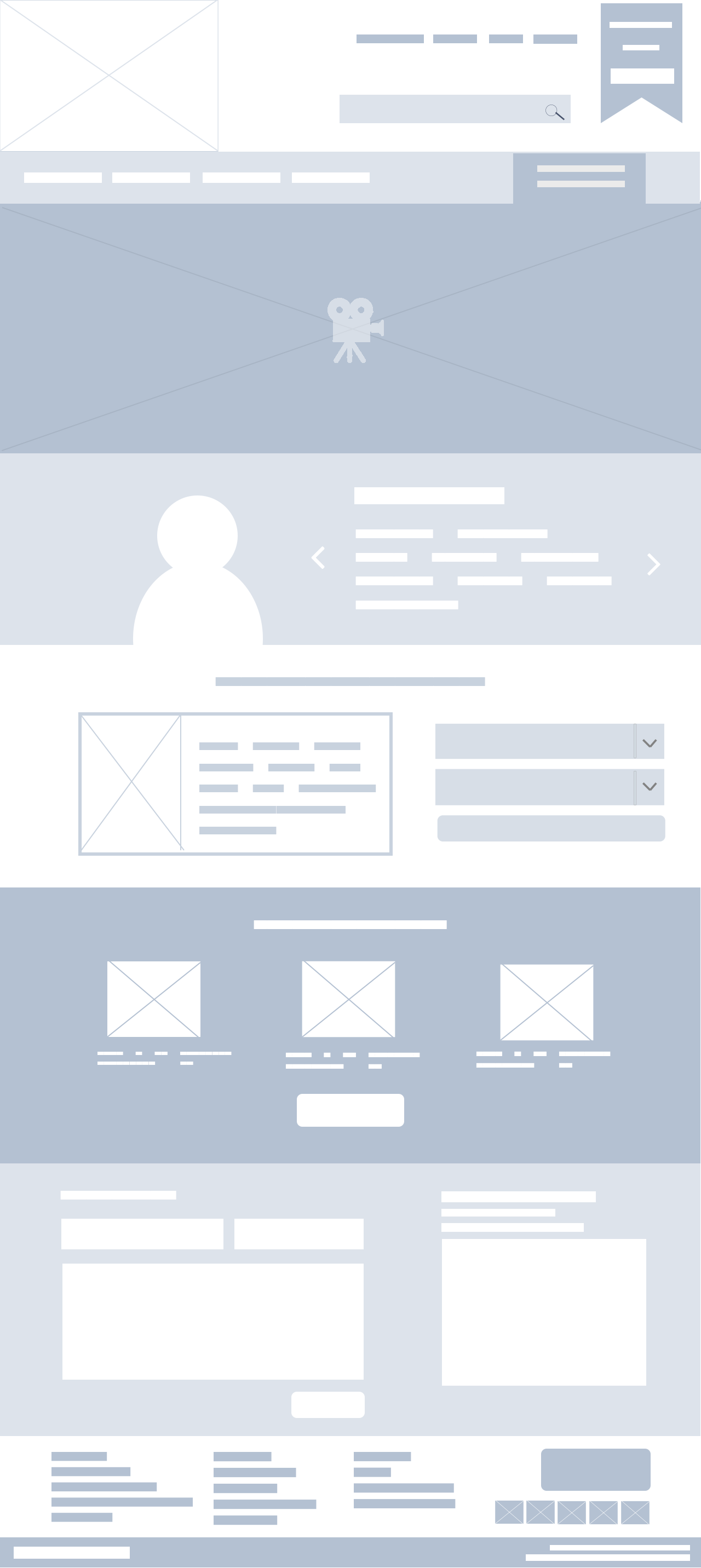
WIREFRAMES
Based on our research we began sketching wireframes, focusing on keep their focus call to action items above the fold.
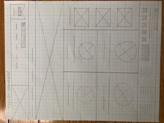
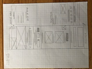
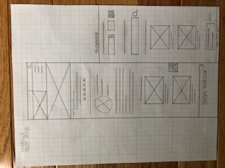
From our team meetings, I took our group notes and decisions and designed the submitted homepage wireframe for team approval. From there, my teammate Alice worked on the mockups. Both wireframes and mockups were created using Photoshop.

CAMPAIGN STRATEGY AND DESIGN PIECES
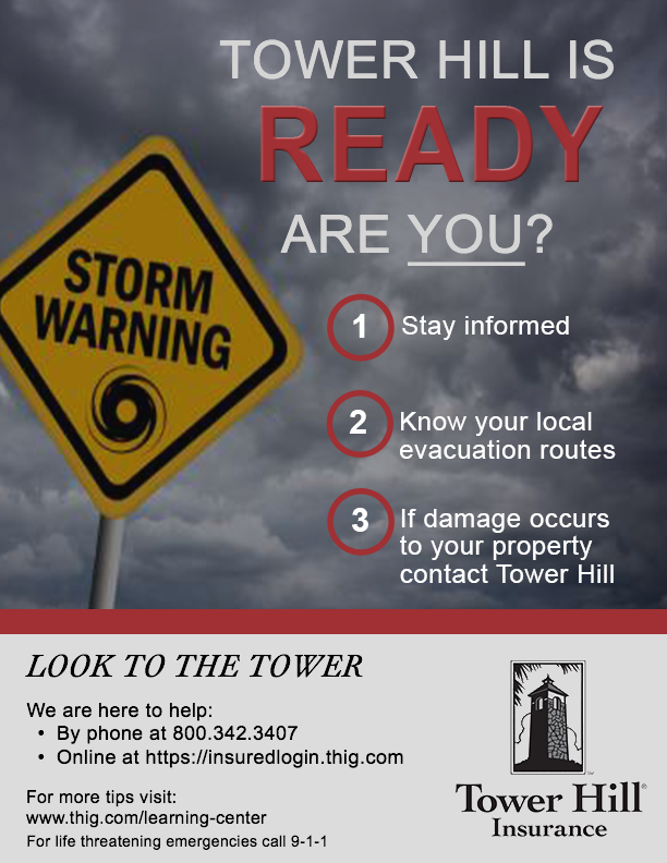
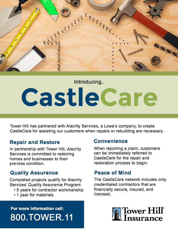
My focus for the campaign strategy was on a brochure or informational flyer. I designed two different types, the first bring attention to what THIG’s client can do to prepare for a hurricane. The second brings information about a new program THIG offers. I designed them using color, typography, and layout placement to bring attention to call to actions, headers, and important content.
USABILITY AND USER EXPERIENCE TESTING
Our team coded a rough draft of the website, the coding was split up and I took on the post and section pages of the custom WordPress site. After submitting our rough draft the competing teams evaluated our site for content and usability. Each member of the other teams tested our website as if they were a first time user, and in return answered teacher distributed usability testing questions. Additionally, THIG tested our website and provided feedback as well.
Our team took the user feedback, and prioritized the changes that would best to allow the user easier content readability and usability of the site. Below are the changes we decided to make as a team:
- search bar was too large – minimized the size of the desktop search bar, for mobile and tablet view a search bar icon was created.
- drop down navigation hard to read – a dark blue background with white font was used to increase the distinction between the background and text.
- confusion on which page they were one, suggested breadcrumbs and page headers – breadcrumbs were added to the top of the page content.
- not completely responsive – additional changes were made to complete responsiveness of the site.
- wants to see a quick quote section displayed closer to the top – For the desktop we moved the quick quote section within header image/video of the homepage. This allows the user to view above the page break. Quick quote was moved to the second section on the mobile version.
- quick quote product drop down needs a drop down indicator – an arrow indicator was added to let the user know that there are more options in the form of a drop down.
- sidebar is too generic looking – the sidebar was redesigned, a slight shadow effect was added to the boxes backgrounds and the grey and dark blue from the color scheme to make the call to actions pop.
WHAT I LEARNED:
This project allowed me the opportunity work in a team on a project from concept to launch. Early on I realized organization and attention to detail was key. Since we all designed and coded different aspects of project deliverables I had to label and clearly define all documents, photoshop layers, and images. This allowed the team lead and other members easily distinguish their purpose and avoided confusion and questions when sent to them.
Usability testing was to me, the most important aspect. I was able to see that even though we, as designers and developers, created what we thought was a seamless user experience there were still areas that needed improvement.